PRODUCT X
HEALTHCARE WEBSITE UX
CLIENT
OGILVY HEALTH
DELIVERABLES
USER PERSONAS
DOMAIN RESEARCH
CONTENT STRATEGY
SITEMAP
UI SKETCHES
USER FLOWS
MOBILE & DESKTOP WIREFRAMES
MY ROLE
UX Designer
TIMEFRAME
1 Week
01. DEFINE
SUMMARY
Client X has been granted permission to launch in the United Kingdom the first Over the Counter (OTC) therapy to treat Erectile Disfunction (ED).
The treatment will now be available online and in pharmacy, being available for purchase after a short test with 5 questions assessing the risk profile of the customers and determining if they can use it.
CLIENT OBJECTIVE
So, with the permission to sell the treatment OTC comes the responsibility to:
- Educate consumers about erectile dysfunction and the risks associated with it.
- To encourage men to visit a doctor and enter the Healthcare System.
02. DISCOVERY
THE ED DOMAIN AND COMPETITORS
I wanted to gain an understanding of the ED treatment space and how existing brands/products were tackling their web presence.
RESEARCH FOCUS AREAS:
- Heuristics
- Touchpoints
- Content strategy
- Usability/Findability
- Tone of voice
- Look and feel
TOP LEVEL CONCLUSIONS INCLUDE
- Competing ED brand/product websites are difficult to find online.
- Web search results are predominantly made up of advisory websites such as NHS & WEBMD
- Viagra is the leading brand name in the ED space.
- OPPORTUNITY FOR BRAND X TO GAIN TOP WEB SEARCH RESULT POSITIONS
USER INSIGHTS & DATA PROVIDED BY UX RESEARCH TEAM
Men (55 y.o. +)
- Had symptoms and are concerned about their problem.
- Not really sure if it is ED.
- Too embarrassed to discuss the problem with their doctor.
- They have heard about ED and potential treatments.
- Not sure how treatments work.
- The benefits and the risks of treatments.
- Don’t know how/where to get the treatment.
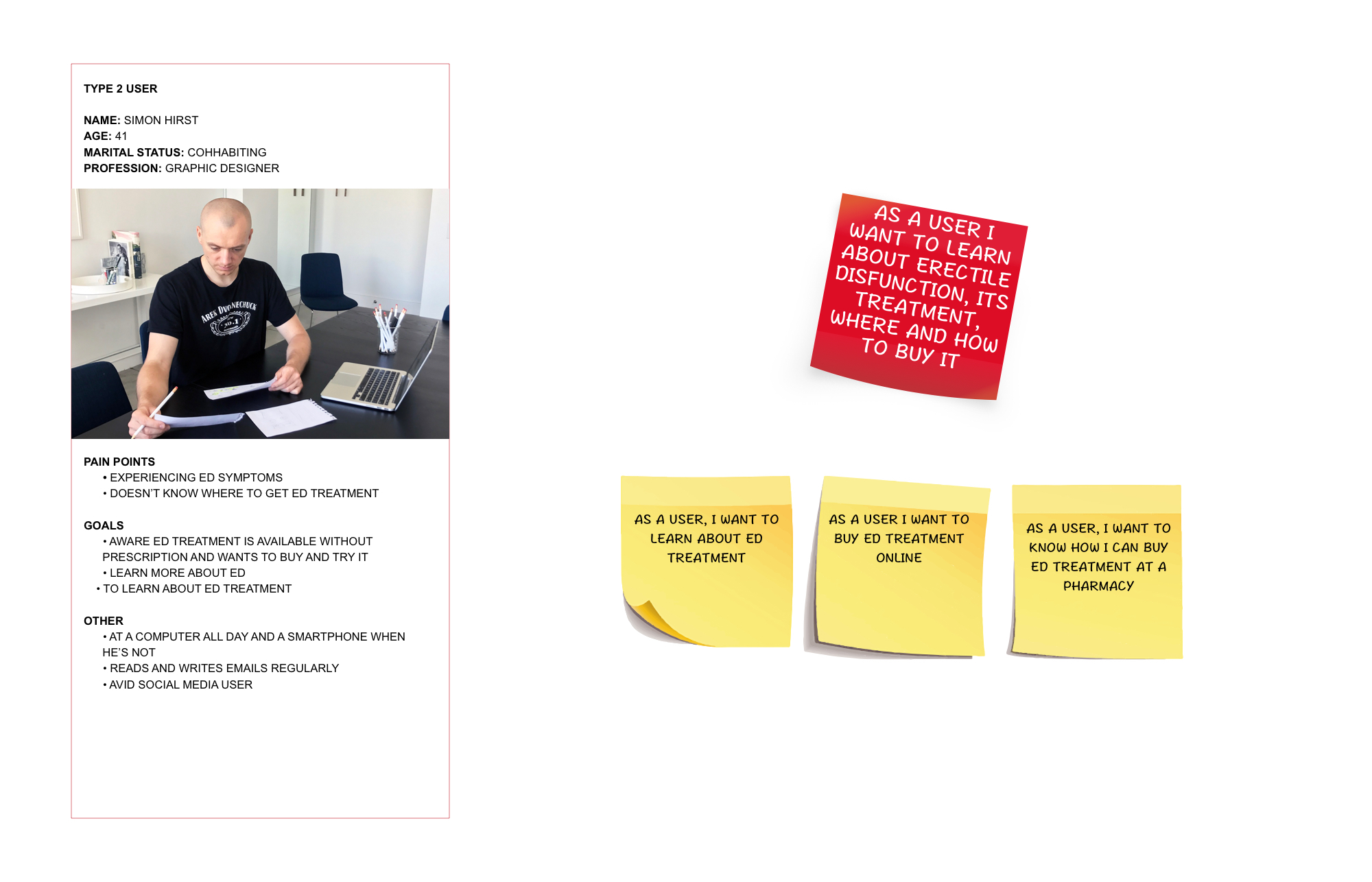
Men (40 y.o. +)
- More familiar with ED treatments
- They have seen the adverts on TV and online
- They know that the treatment is now available without prescription and want to know how and where to get it.
THE PERSONAS
Giving familiarity with the intended audience, the personas allowed me to understand and empathise with user frustrations, pain points and needs.
03. PLANNING
The Consumer website and UX recommendation to ensure that the following objectives are met:
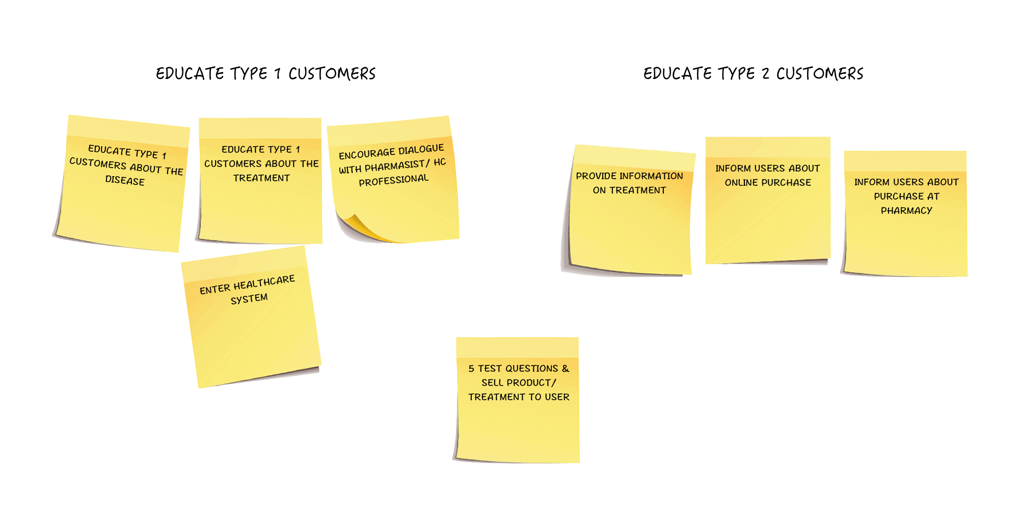
TYPE 1 CUSTOMERS
-
- Educate on the disease and the treatment
- Encouraging them to have a conversation with the pharmacist
- Enter the Healthcare System
TYPE 2 CUSTOMERS
-
- Provide educational information about the treatment
- Functionality to buy it online
IDEAS ADDRESSING USER INSIGHTS WITH BUSINESS OBJECTIVES
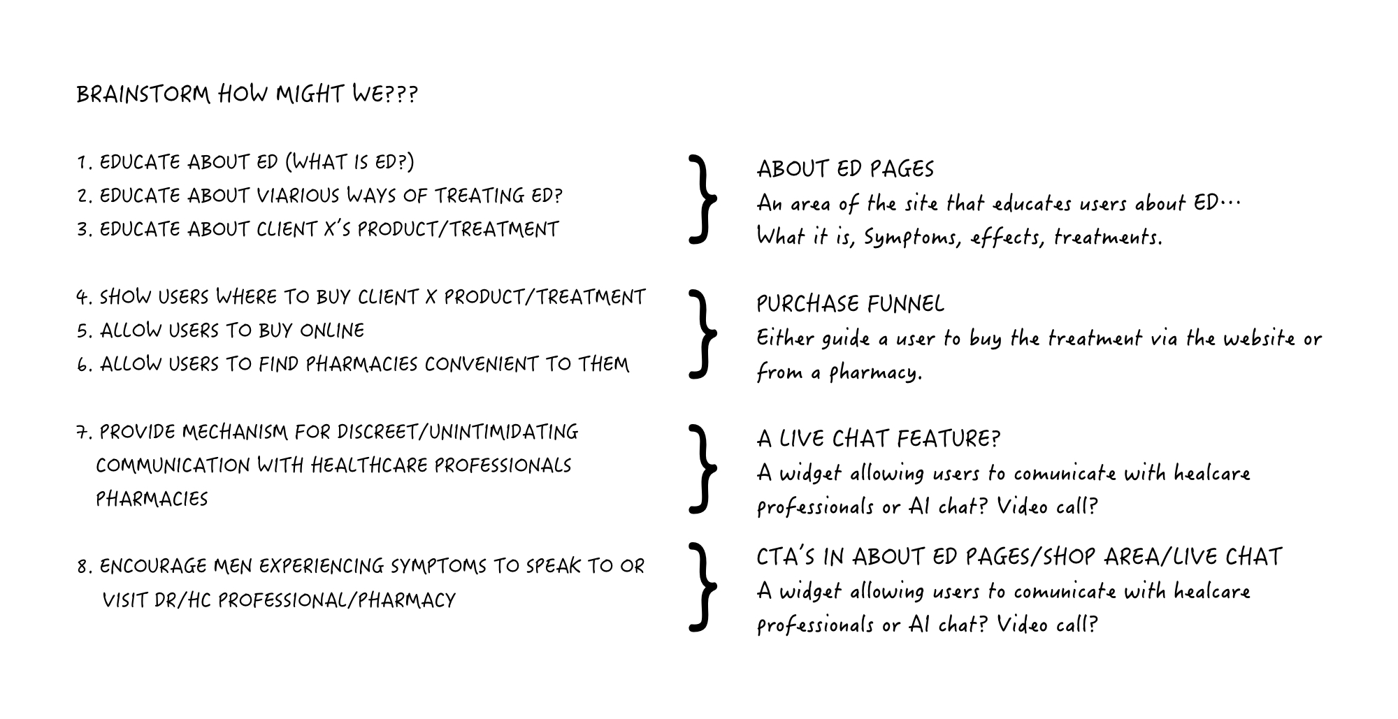
FEEDING SUGGESTIONS INTO THE IA & CONTENT STRATEGY
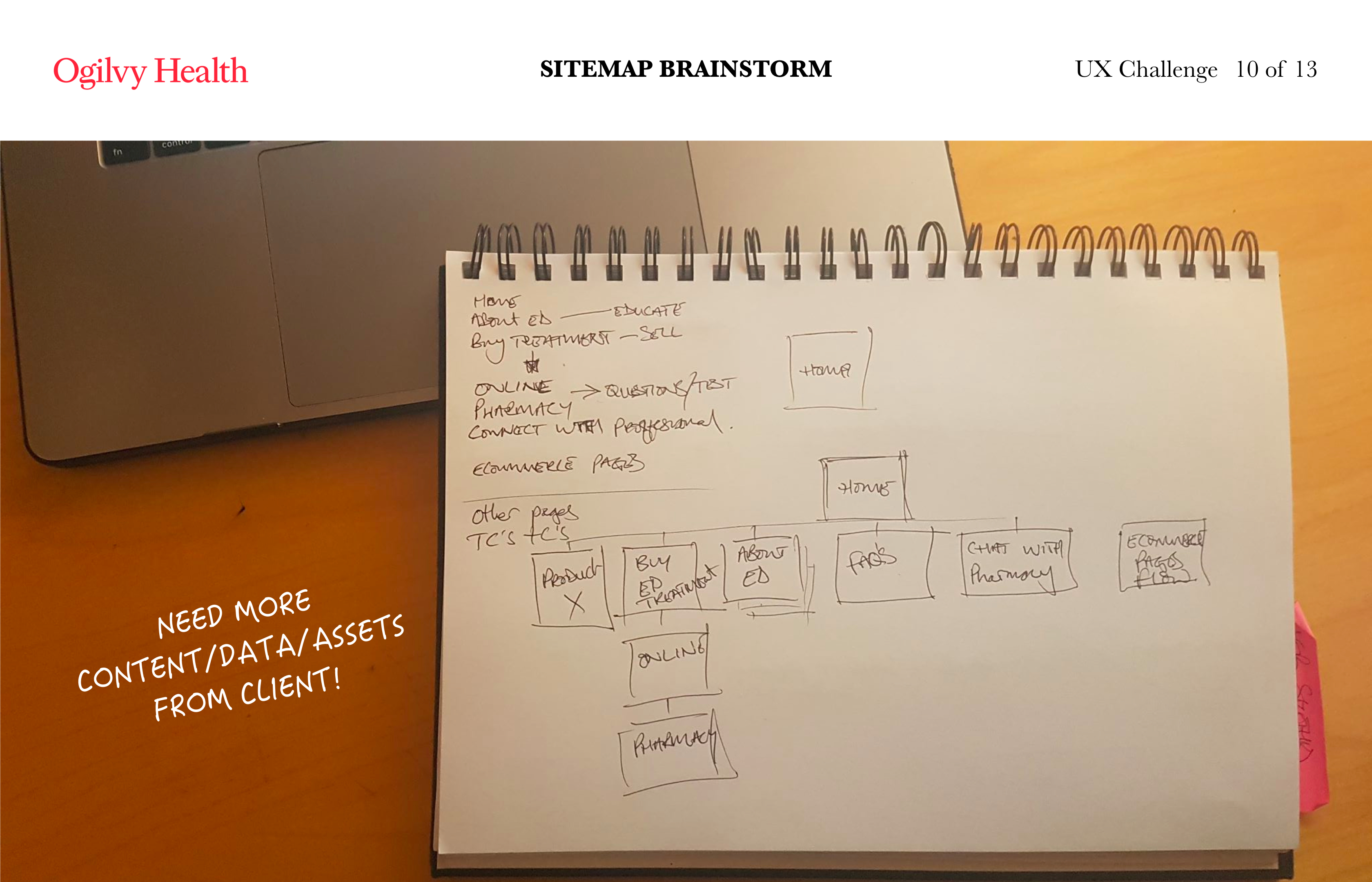
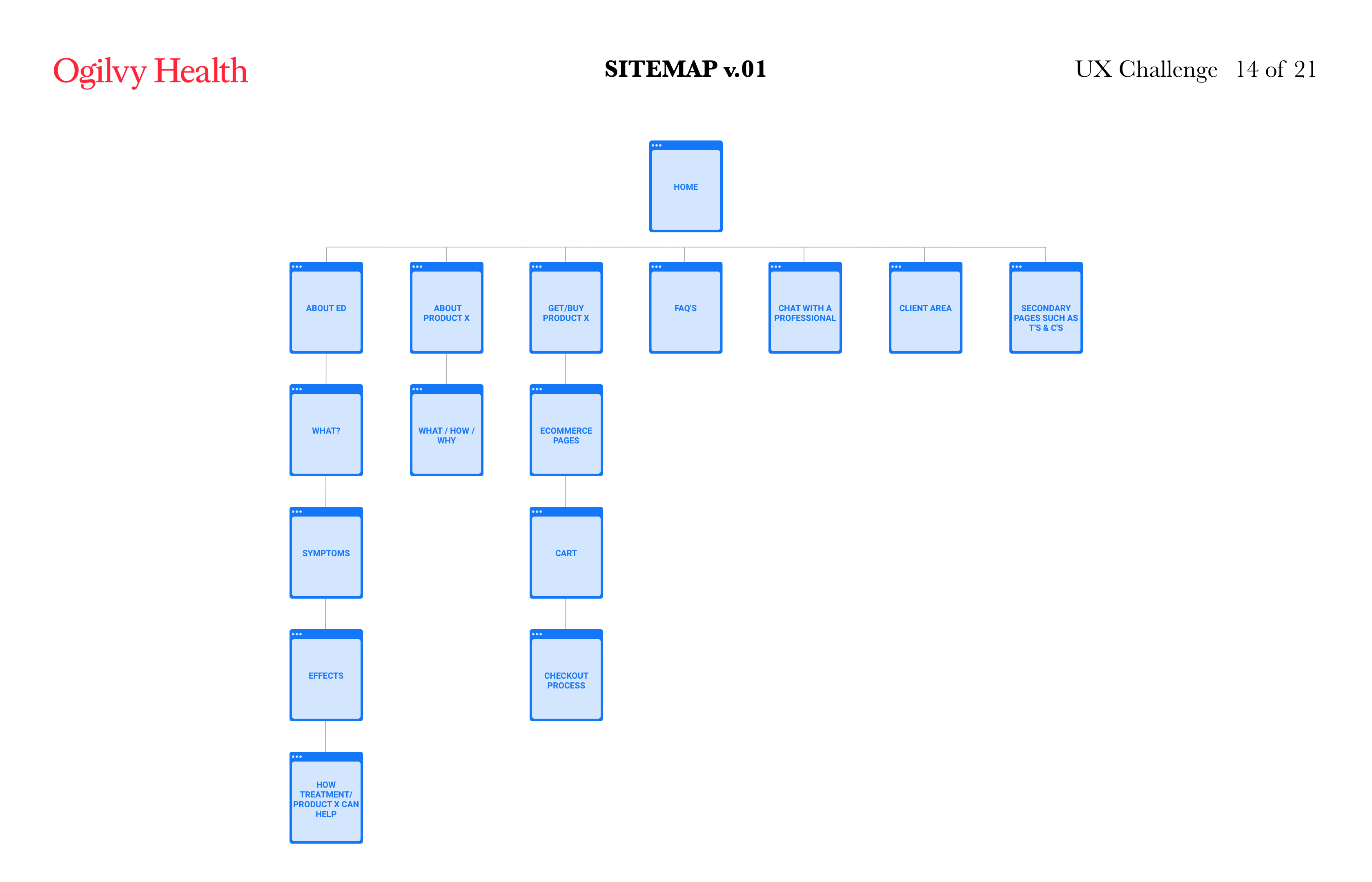
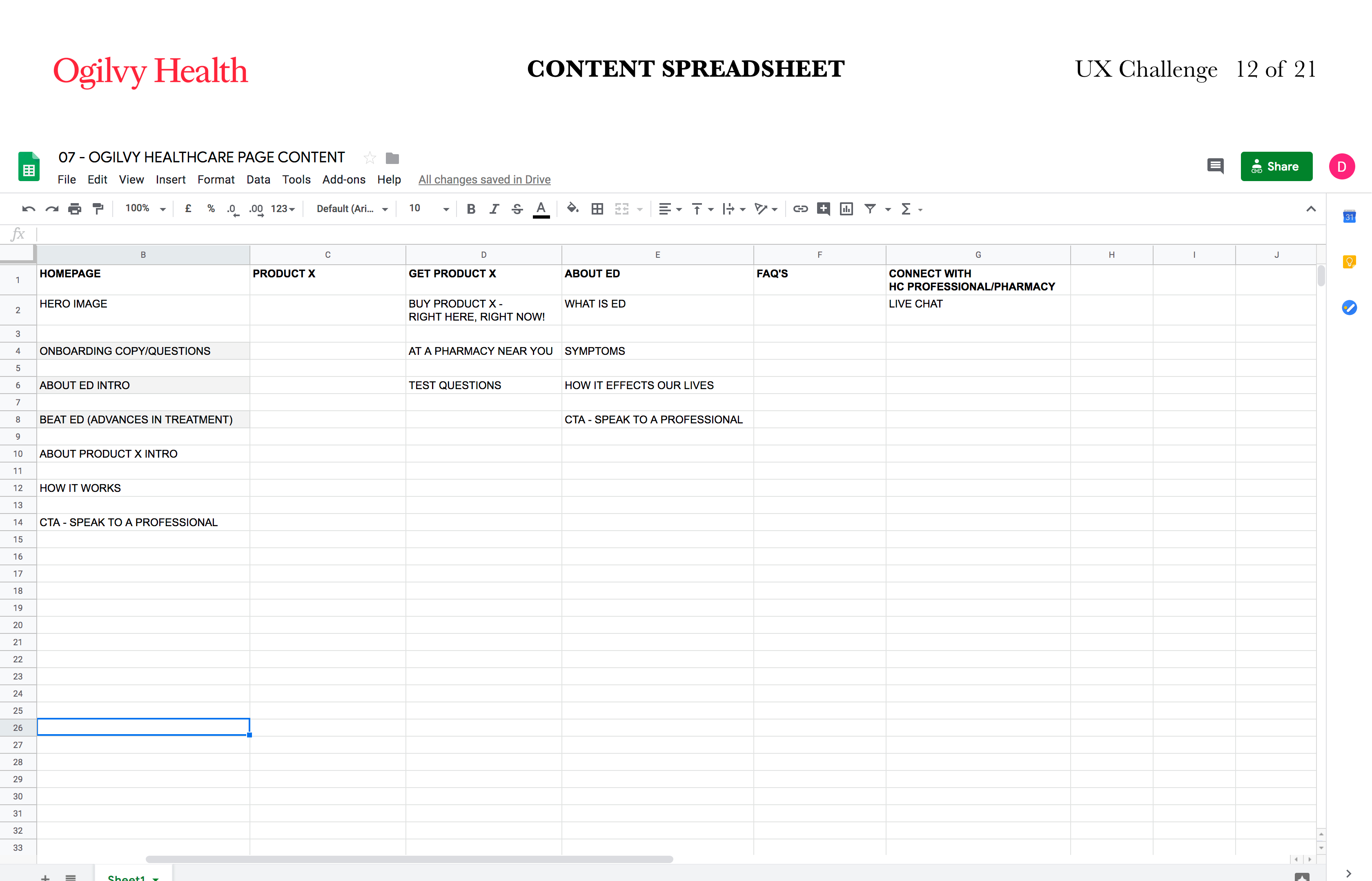
With research insights, personas, their pain points and what they need, I was able to work on initial high level IA in the form of:
- A sketched sitemap.
- This was refined with client feedback to form a foundation for initial brainstorming and UI sketches.
- A content/features spreadsheet.
04. IDEATE & DESIGN
FROM SKETCHES TO WIREFRAMES
I was tasked with delivering suggestions and mid fi wireframes for the following pages/features:
- Menu/Navigation
- Landing Page
- Get/Buy Treatment
- Live Communication Widget
Taking a mobile first approach, I started to sketch out ideas for layout variations, features and functionality.
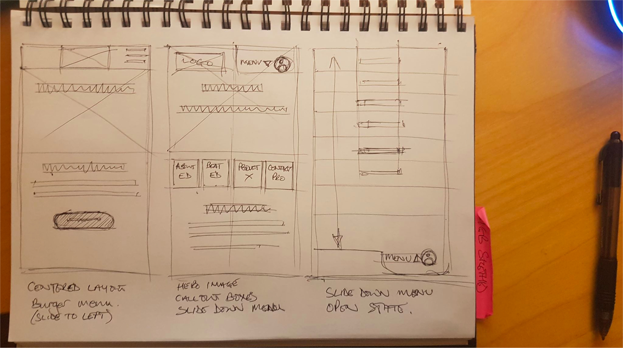
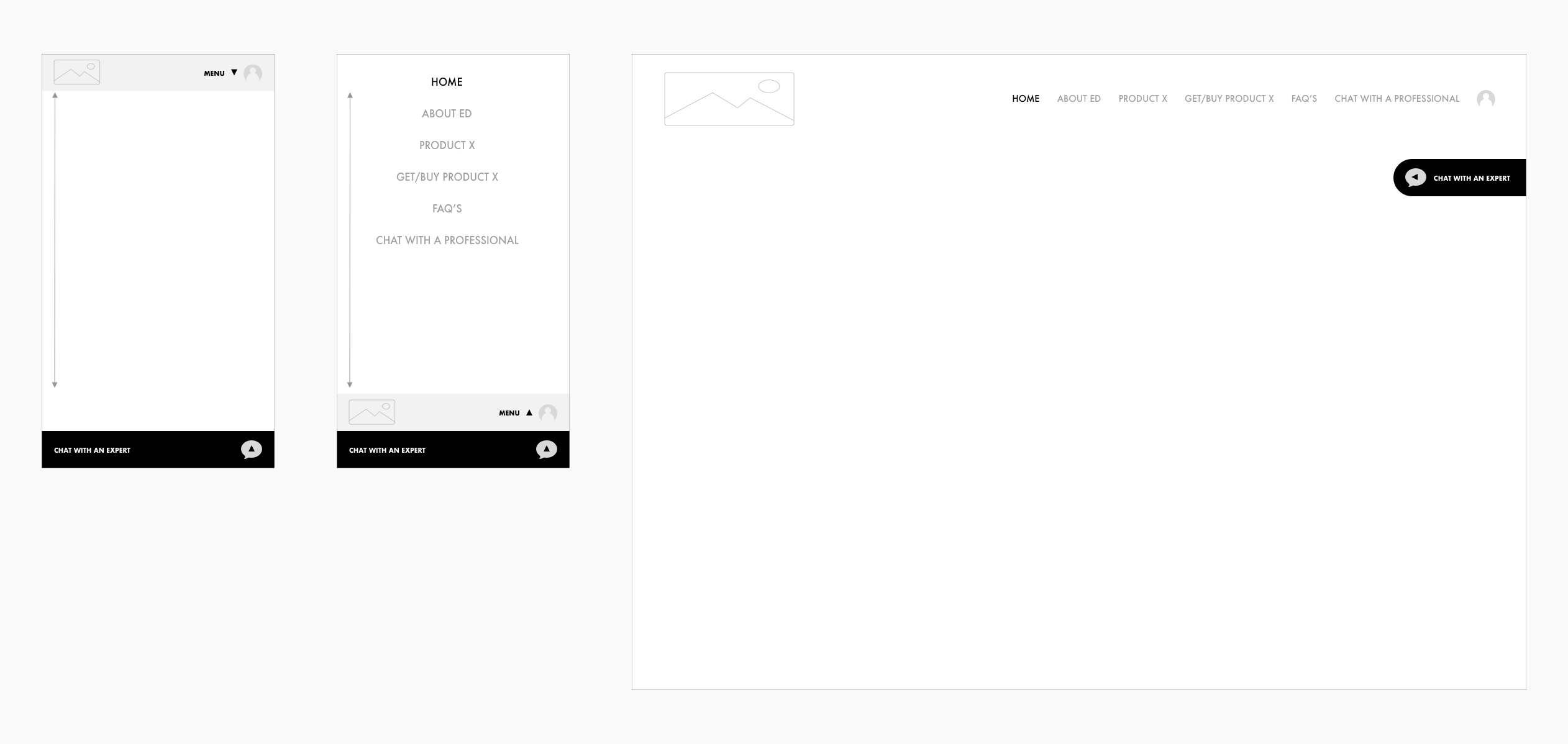
MAIN NAV – MOBILE & DESKTOP
- MOBILE NAV
- Default state closed.
- CLOSED STATE – ON CLICK – Slides vertically to reveal page/screen options
- OPEN STATE – ON CLICK PAGE NAME/”MENU” – Slides vertically to reveal selected page.
- MAIN NAV
- Conventional Nav in header area of page.
- Hover and Selected states indicated by colour change.
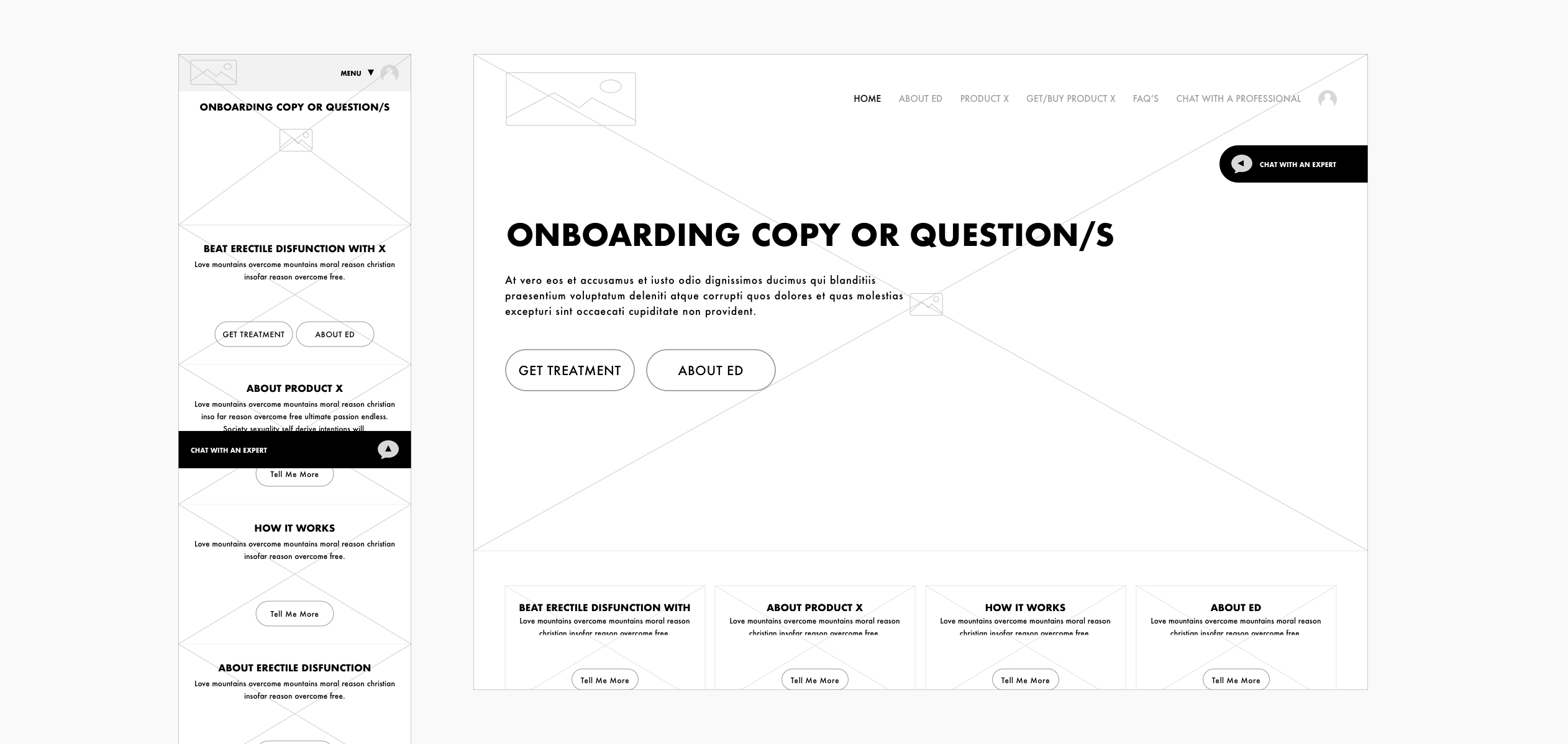
LANDING PAGE WITH CLEAR CALLS TO ACTION & CONVERSION FUNNEL
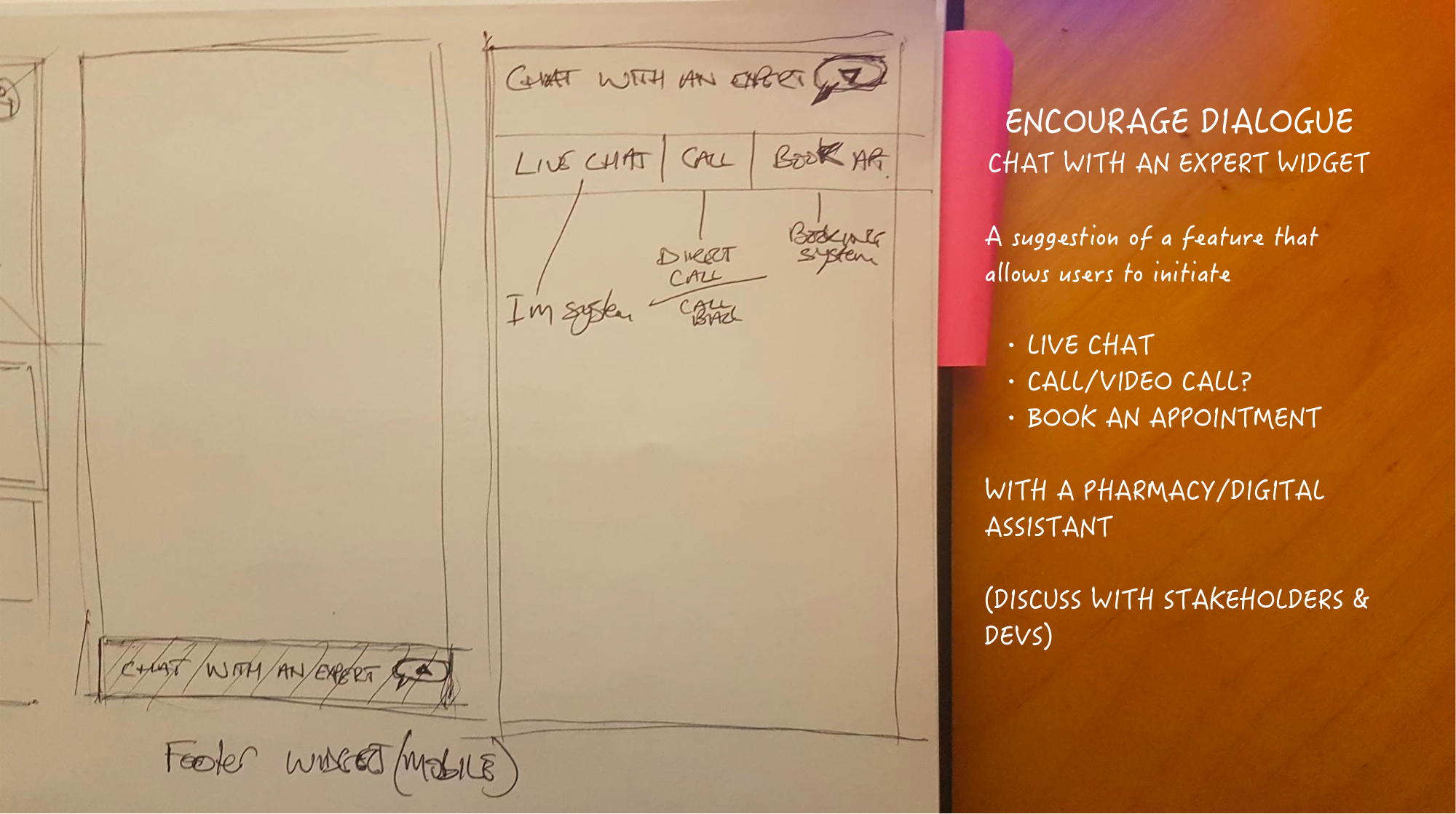
Discreetly communicate with healthcare professionals:
- Live Instant messaging (Consider & discuss AI dialogue)
- Voice Call/Video Call
- Appointment booking
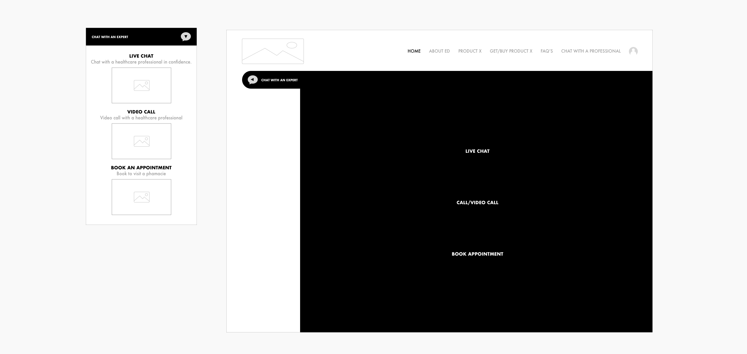
HEALTHCARE PROFESSIONAL CHAT WIDGET (USER TYPE 1)
Discreetly communicate with healthcare professionals:
- Live Instant messaging (Consider & discuss AI dialogue)
- Voice Call/Video Call
- Appointment booking
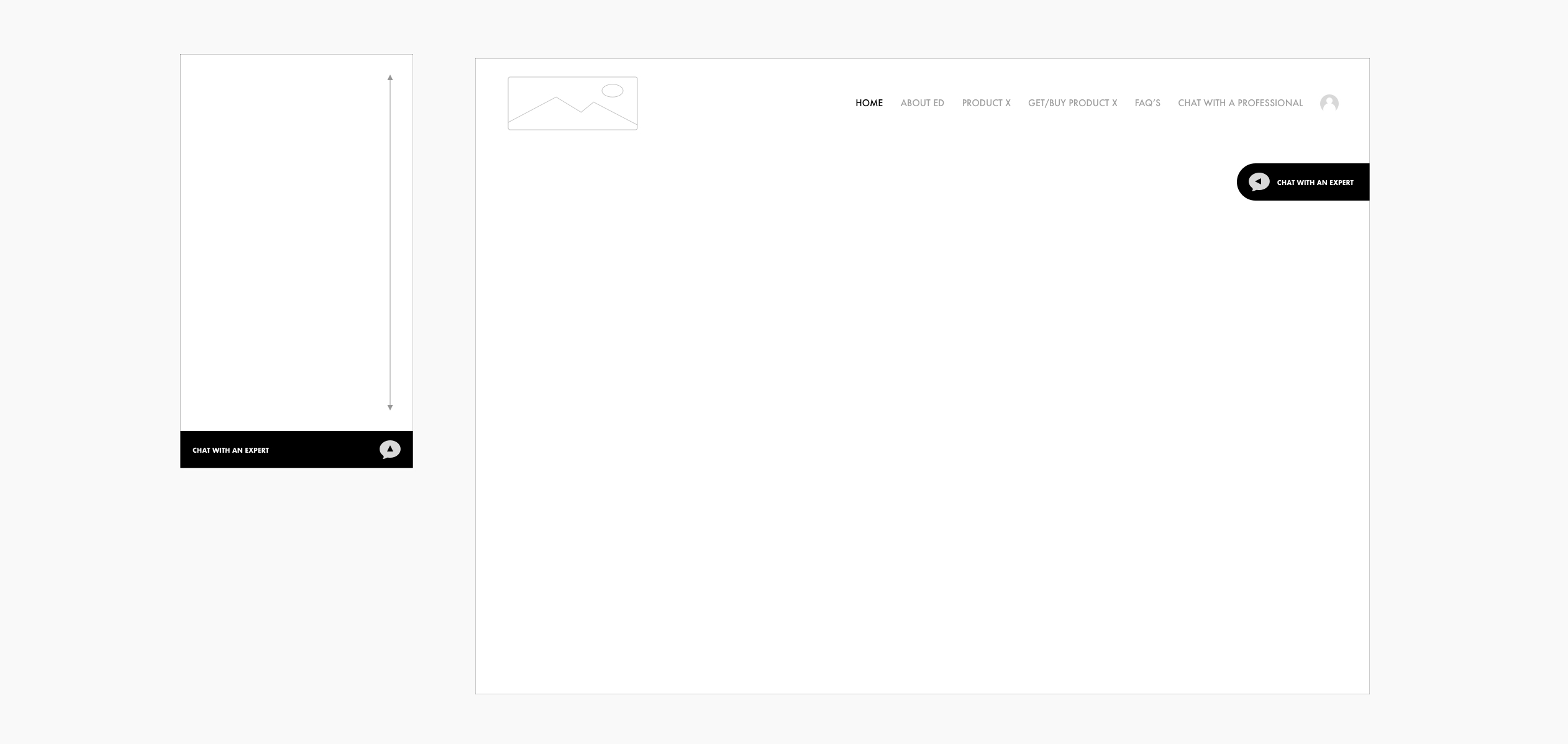
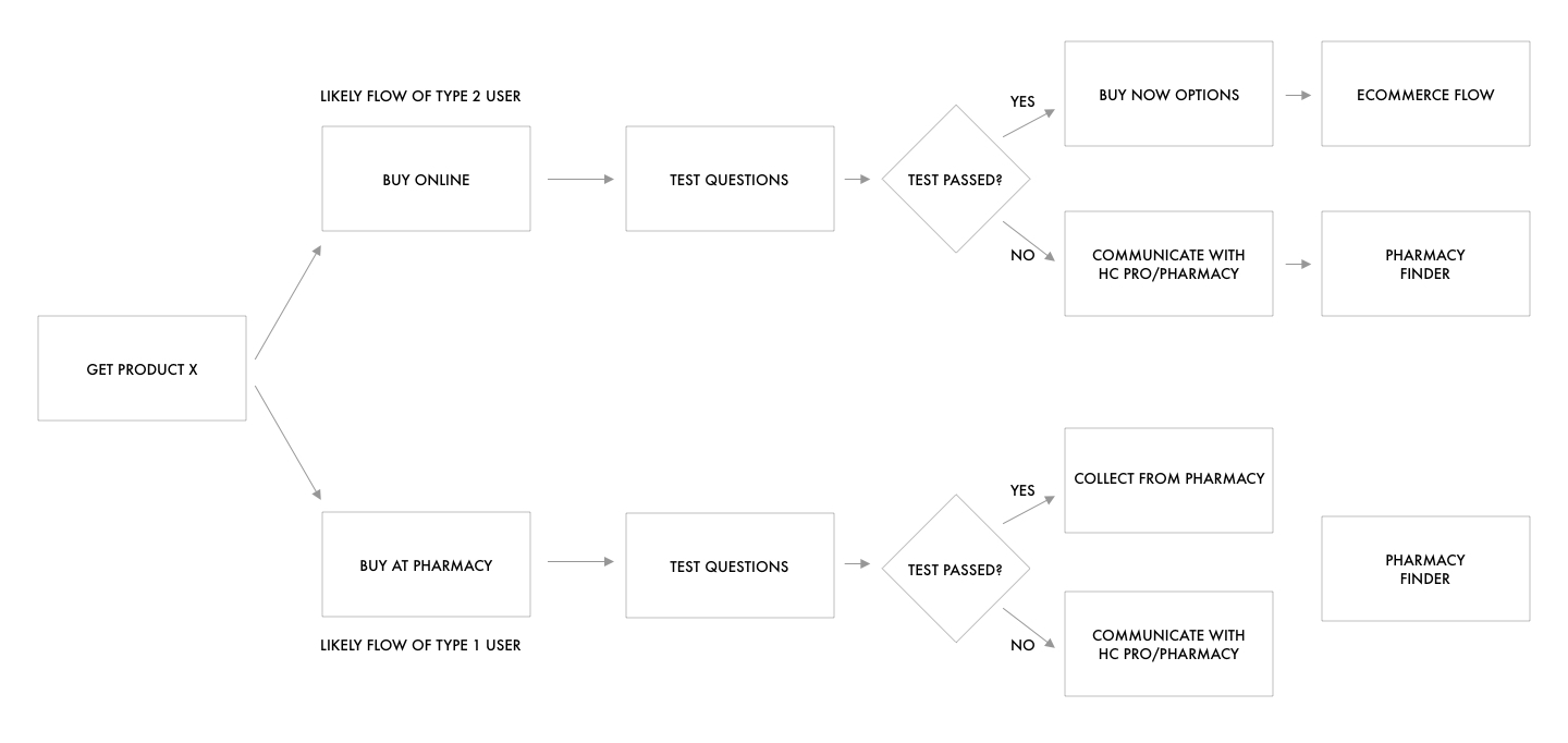
GET PRODUCT X – USER FLOW
This user flow shows journeys for Buy at Pharmacy (Probably user type 2) and Buy Online (Probably user type 2).
In both cases users are presented with the suitability questionnaire before being directed to the relevant method of purchase.
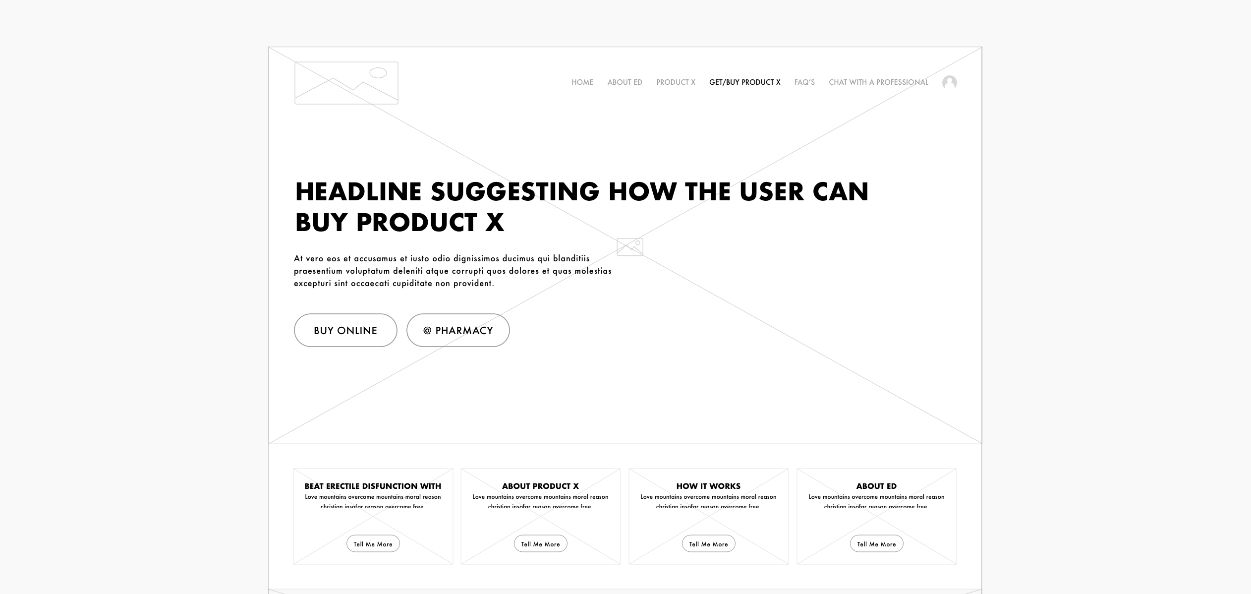
GET PRODUCT X – LANDING PAGE (L1)
Clear headline copy and CTA’s that scroll to relevant anchor point on the page… BUY ONLINE or AT PHARMACY.
GET PRODUCT X – SUITABILITY QUESTIONNAIRE (L2)
Breaking the suitability questionnaire into a multipart form so that the user is not overwhelmed.
On completing the questionnaire the user will be directed to either online purchase flow or pages/screens relating to advice and purchase at pharmacie flow.